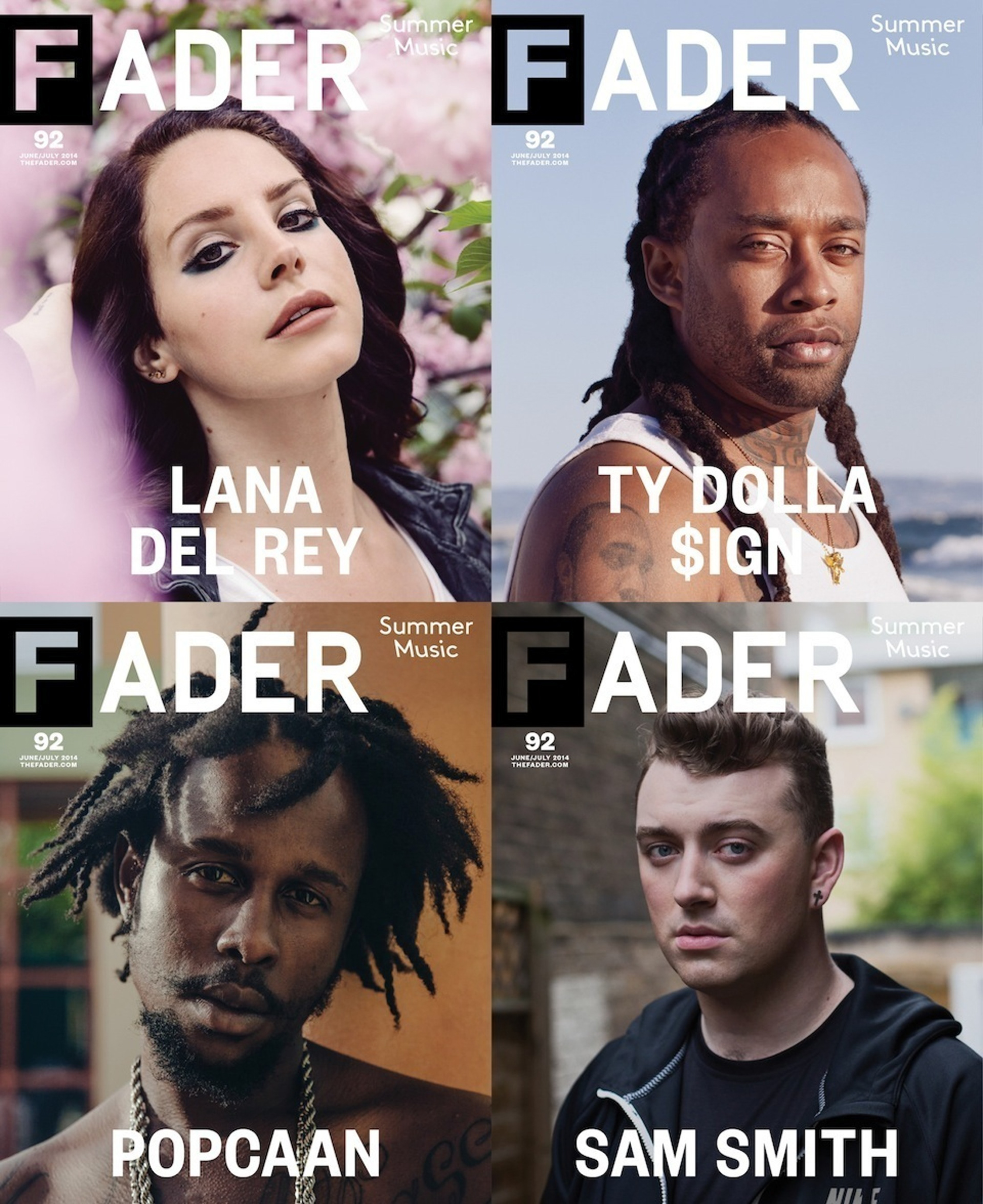
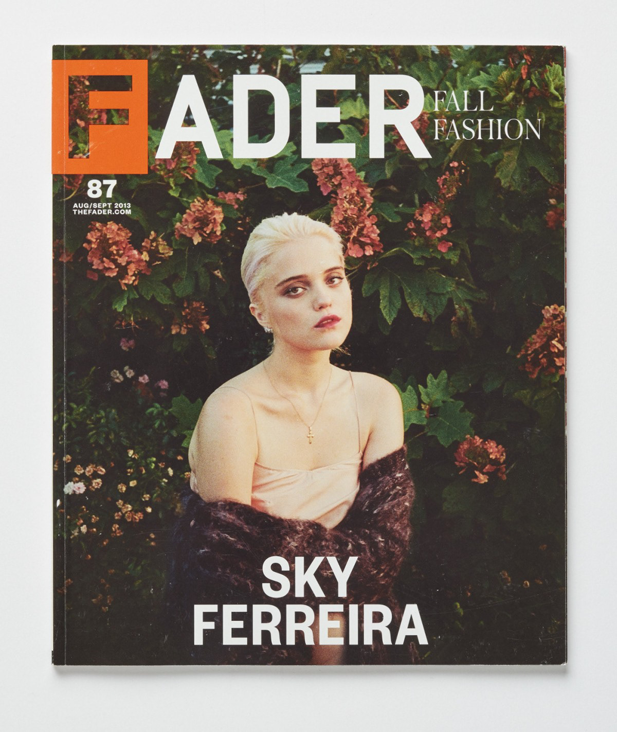
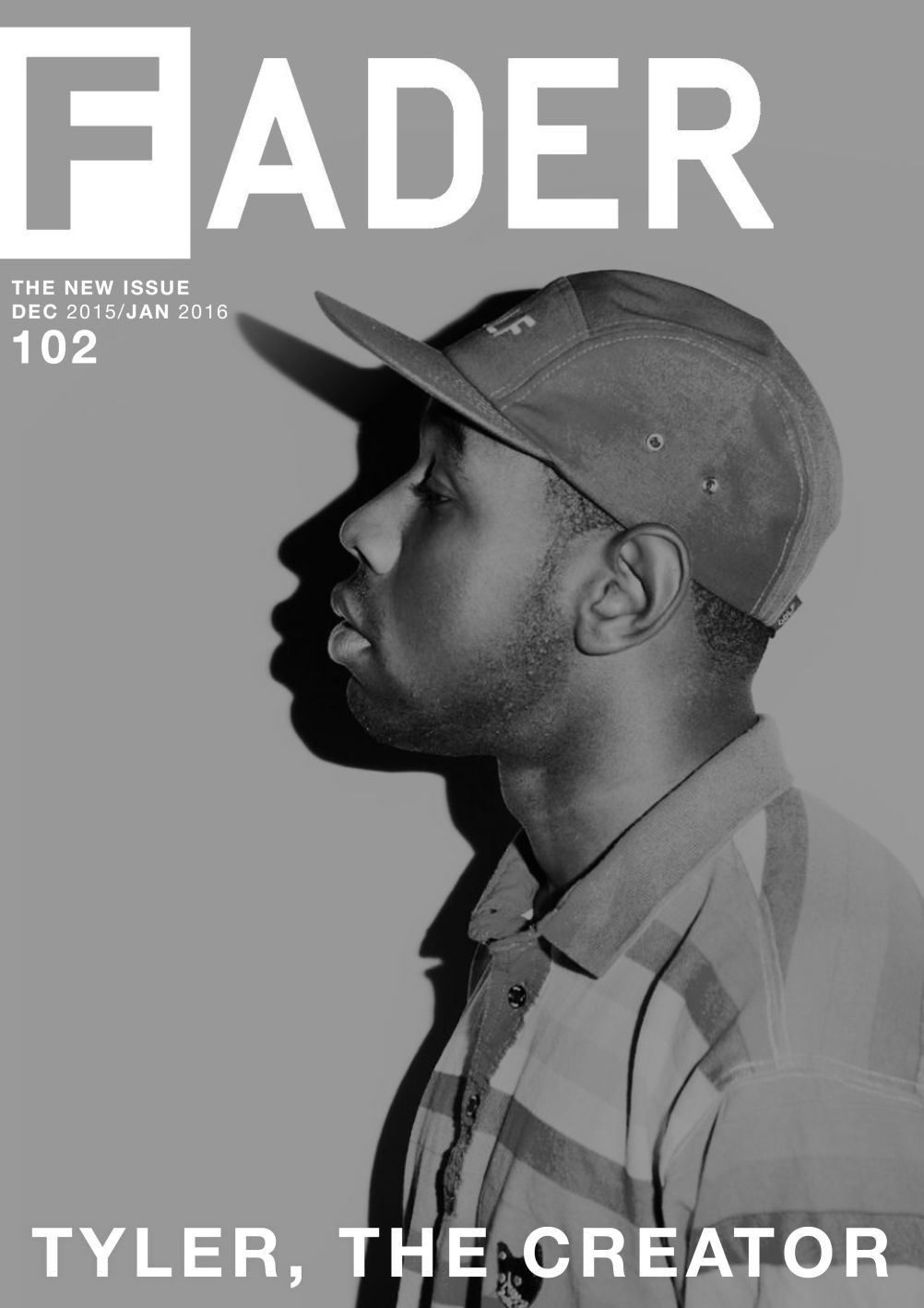
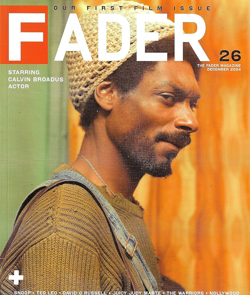
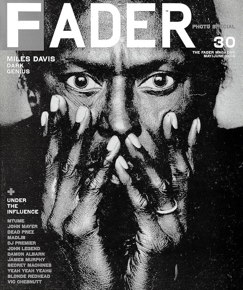
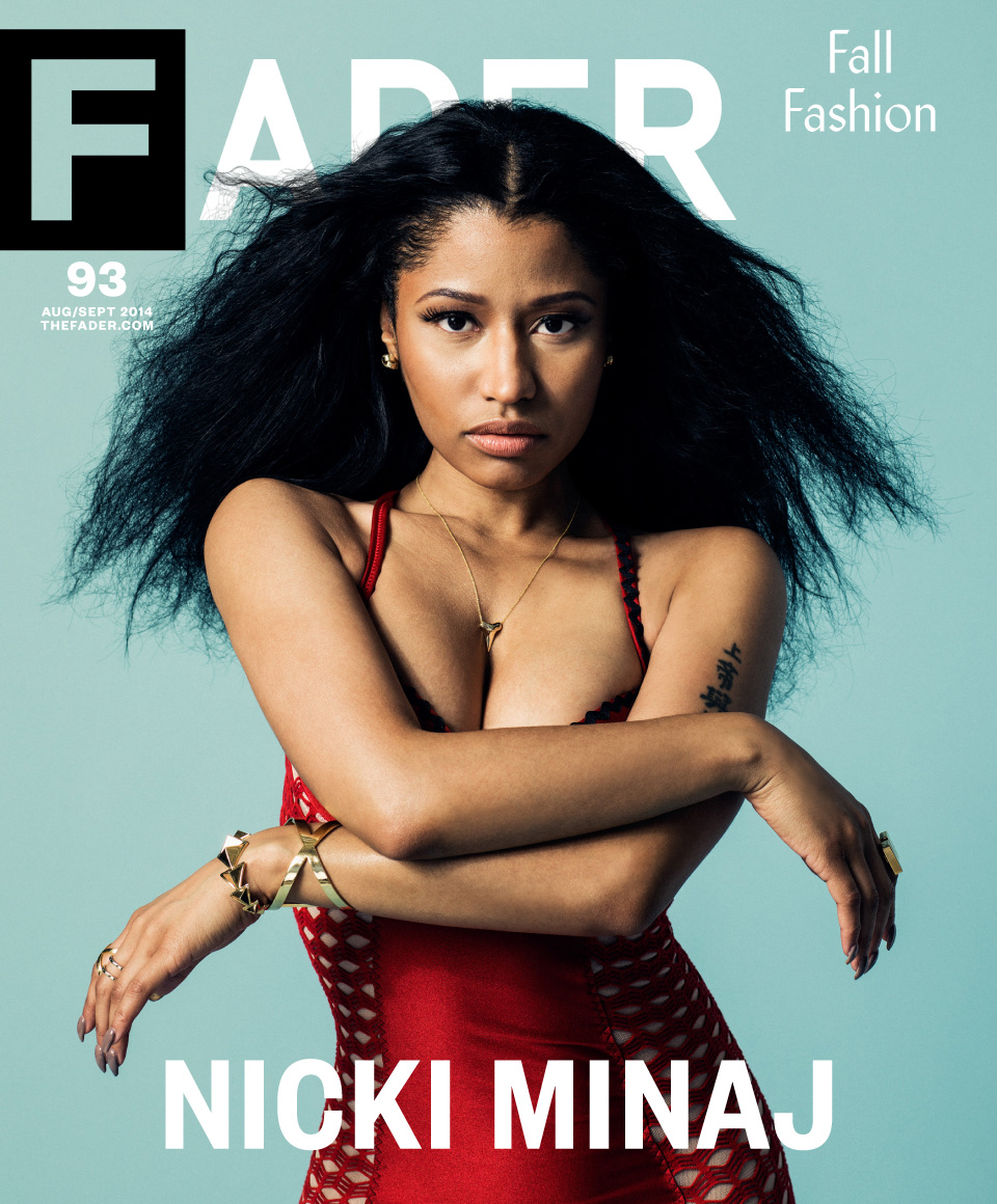
Developed through Stereo Type Haus, this custom typeface was created for The Fader to serve as both the magazine's masthead and primary headline font. The design balances clarity, personality, and editorial flexibility, allowing it to perform across covers, feature stories, and promotional materials. As a core component of the publication's visual identity, the typeface helped establish a recognizable and consistent typographic voice for one of music and culture's most influential magazines. The project was later featured in Type Specific (Rotovision), a publication highlighting innovative contemporary typography and type design.