
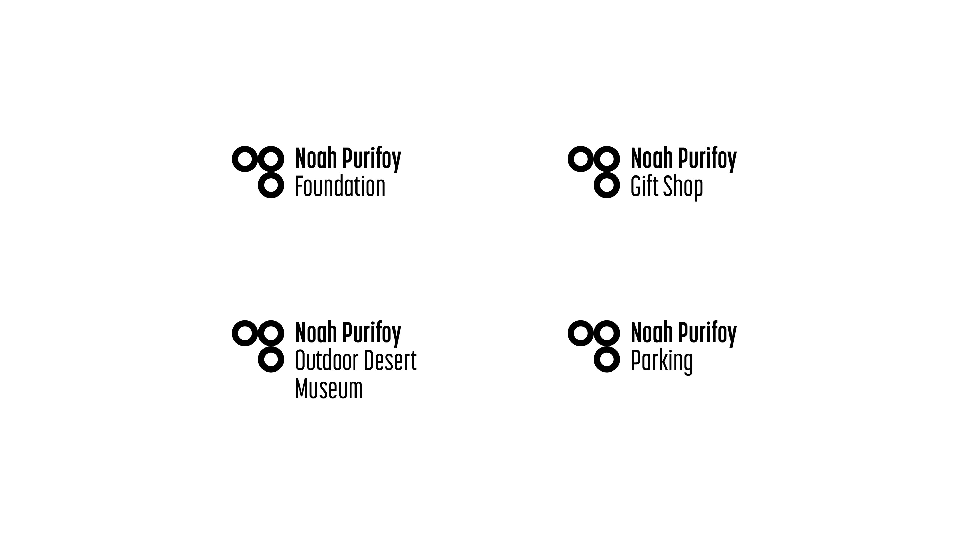
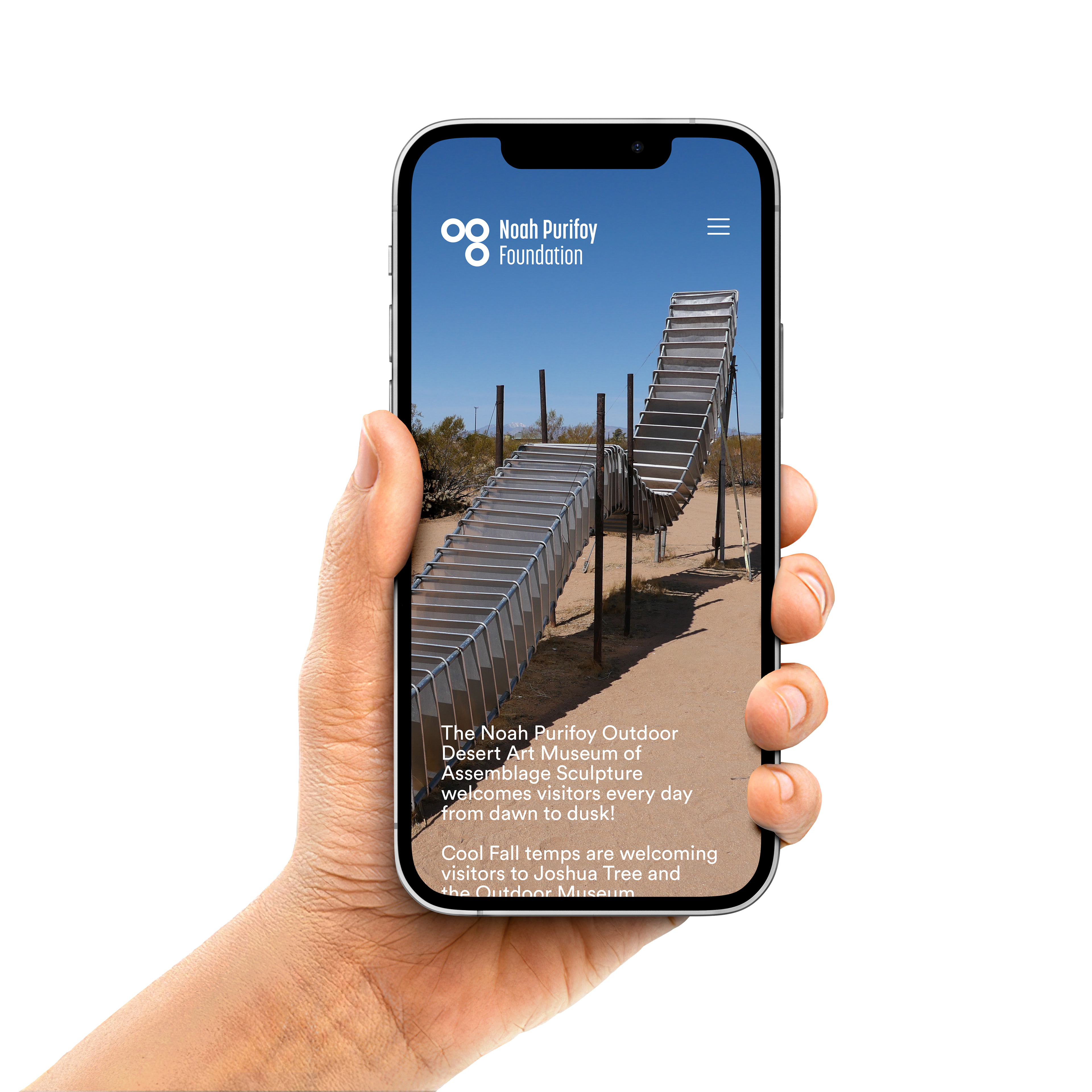

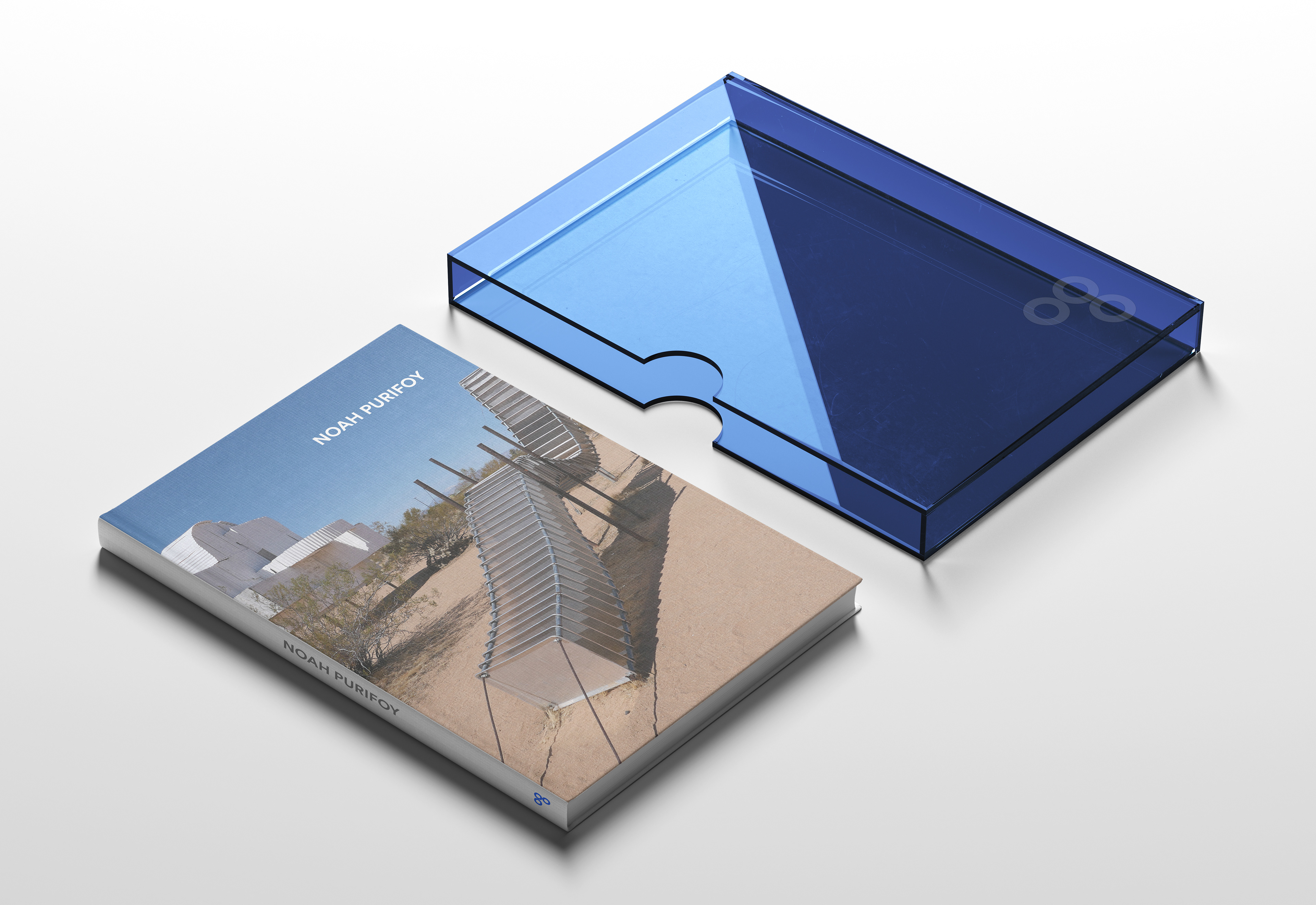

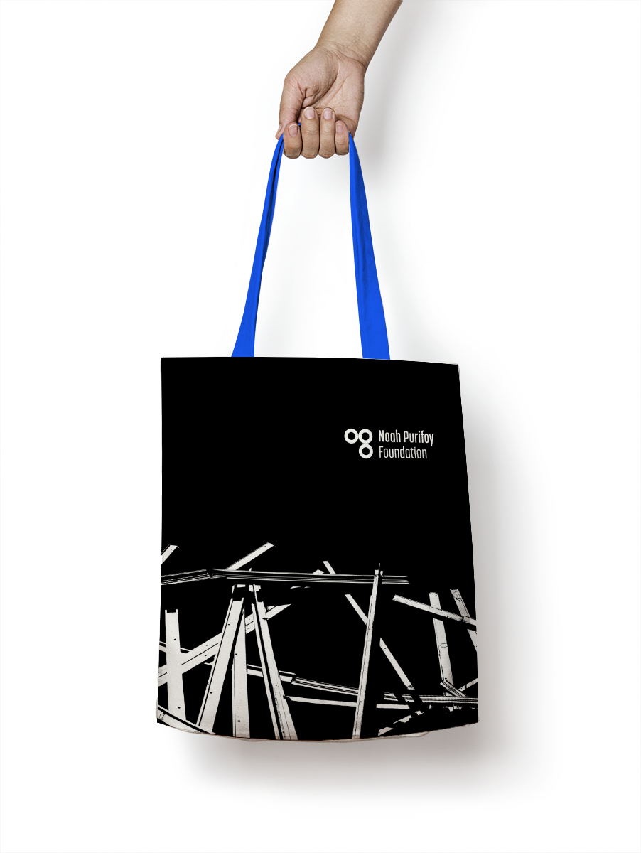
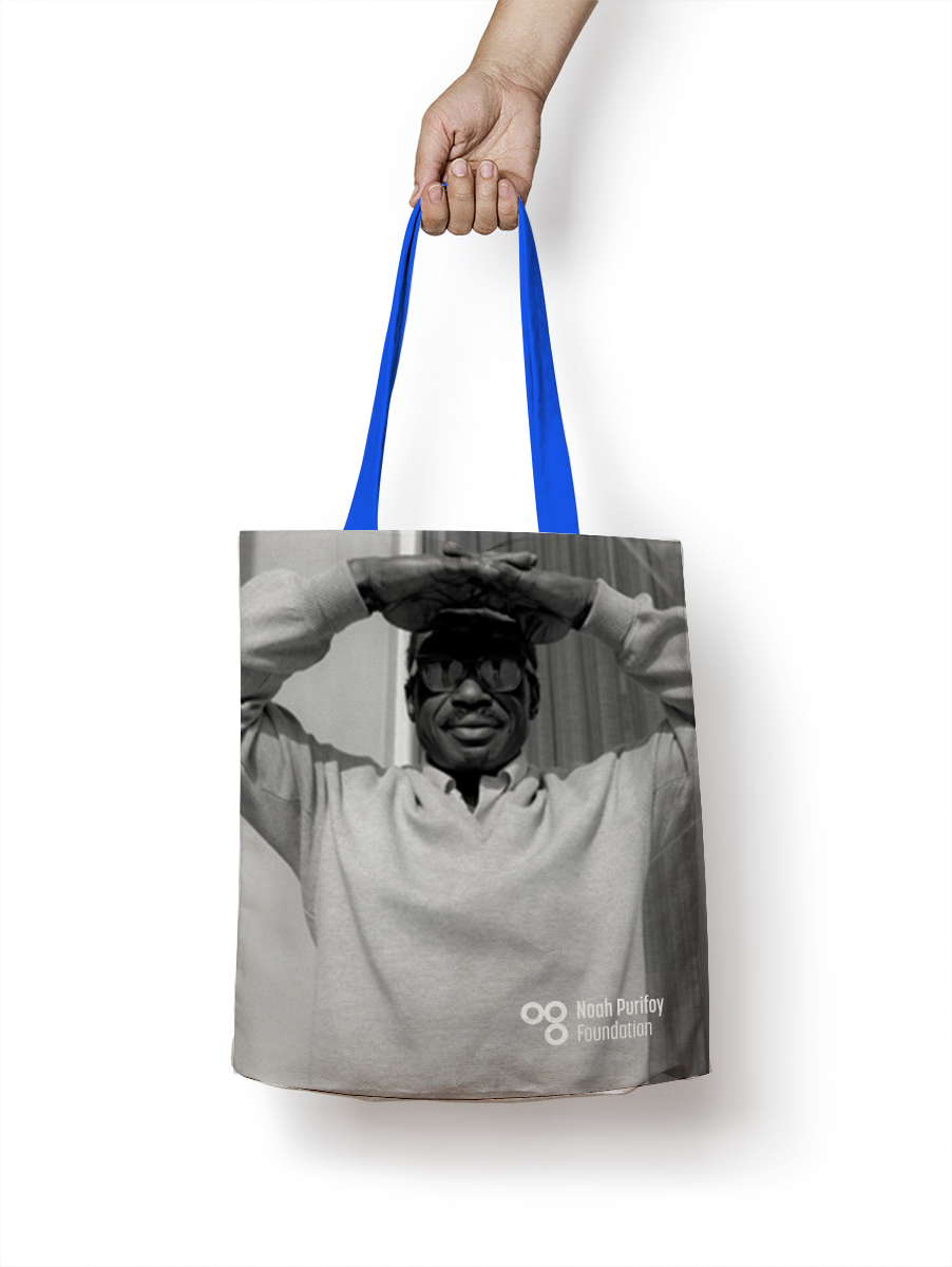

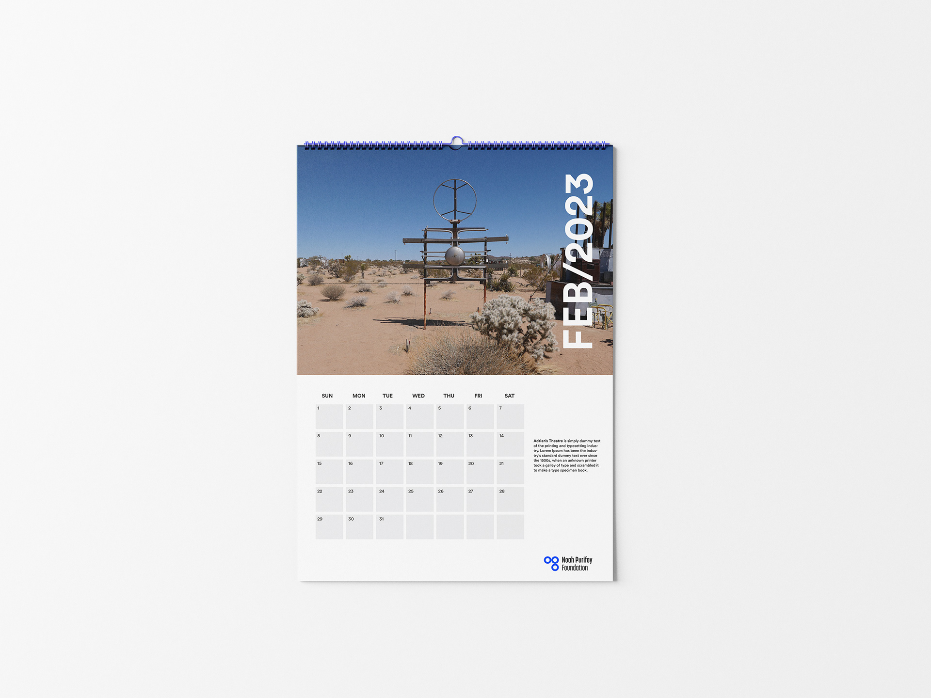

The visual identity for the Noah Purifoy Foundation honors Purifoy's legacy while introducing a contemporary framework for the organization. Inspired by the artist's assemblage practice, the identity balances the spontaneity and improvisational nature of his work with a more deliberate and structured graphic language. At the center of the system is a brand mark derived from the Foundation's iconic welcome sign, constructed from stacked rubber tires. Its simple geometric form provides a strong visual anchor that complements, rather than competes with, Purifoy's expressive sculptures. A bold color palette, influenced by the artist's use of blue throughout the outdoor museum, reinforces the connection to the site while creating a distinctive and memorable presence across print, environmental, and digital applications. The result is a flexible identity system that celebrates Purifoy's enduring influence while helping the Foundation engage new audiences for generations to come.